PRODUCT DESIGN , BACKEND DEVELOPMENT
Pomodoroll
July 2022
Role:
Product Designer, Backend Developer.
Overview
Being someone with battles over productivity sometimes, I started looking for methods to help with a long-term boost. On my search for improved productivity, I discovered the pomodoro technique.
The pomodoro technique is known to help people while studying, working, writing, coding and a lot more. It’s a very simple method used to work on tasks at intervals. Pomodoroll is a web-based productivity tool to help you practice the pomodoro technique effectively.
The Challenge
The idea was to challenge myself. When I started using the pomodoro technique, I simply just used the timer on my iPhone. Because it was exhausting having to change the timer every now and then, the thought of building one for myself came about. Even when I had found other pomodoro timers, I still wanted to build one — and I did. I built a desktop timer with Python and a GUI library called Tkinter. After I had built it, I had issues distributing it as I wasn’t a registered and identified developer on the MacStore. Sharing the app with my friends and followers was something I really wanted to do, so I tried and tried, until I couldn’t. I gave up and decided to build one for web. I called it Pomodoroll.
Research & Discovery
Methods: User Interviews, Desk Research, Usability Testing.
Ensuring usability was very important to me while designing this product. With the pomodoro technique not being very common, I had to make sure this product was easily usable.
To do great work and see things from the user’s points of view, I had short listening sessions(interviews) with 4 people. With the responses from these sessions, I deduced that not many people practice the pomodoro technique because they hadn’t heard of it. Also, I was able to note pain-points, such as:
- Having short attention spans,
- Low productivity,
- Poor Time Management,
- Excessive Multitasking.
In addition to the interviews, I also did primary research to make sure I was implementing the full concept of the pomodoro technique.
Towards the wrapping up of the project, I conducted usability tests with 2 people to get feedback from their experience with the product.
Solution
During the research/discovery phase, I noted the importance of progress reports to people. Out of the 4 people interviewed, 3 of them had mentioned wanting to know the total of how many completed pomodoros they have. Their reasons were mainly to keep track of progress. Because the aim was to build a simple app, from the deductions from my discovery, I described my solution as a web app that allows users to enter a task, select a timer length and start/stop the timer. It’s also programmed to automatically change from work time to break, as well as notify users when it makes the change with a sound. Another feature it has, is to tell show users a total of pomodoros they had completed and give a view of recent tasks they have entered on the app.
Personas
After my discovery and research phase, I understood my potential users had a similar goal, “Increased Productivity”. With this information, I created a persona to match this product.
In a nutshell, the product is for people who work or study, hobbyists, and anyone who want to manage their time better.
Project Planning
Journaling and Planning are two things that helped me improve my productivity and be intentional about things. As the designer and a developer for this project, I had to plan towards what I needed to achieve. However, it was still poorly planned. I strategized the design and created structured plans for the features, requirements and general experience. For the backend, I was only able to structure a logic for some of the features.
The Process — Design & Decisions
Tools: Figma, Lottiefiles, Remixicon, BoringAvatars.
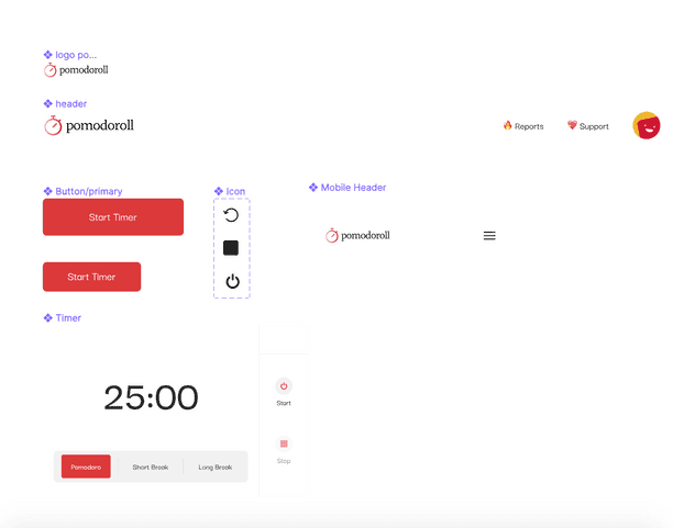
It started with sketches for the web app. Once I get an idea in my head, the first thing I do is to sketch it out to get clarity. I began to iterate on what I had sketched. I was also confused on what feel it should give. I wanted to design a user-friendly and simple app that gives a calm feeling. I chose to give a calming feeling because I during my listening sessions in the research stage, I had noted how some people feel pressured while working. So to ease this pressure, I chose to make use of calming colours, with red as the primary colour because it’s the colour of tomato — which the word pomodoro is coined from. I also decided to make use of a cool font type and emojis to align with my goals of designing a calming and friendly product. Following my decisions, I proceeded to create components and a simple style guide to work with.

For the hi-fi wireframes, I had begun with the use of solid colors as backgrounds but it did not give what it was supposed to gave. :)
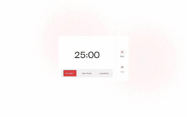
Then, I started to iterate the use of layer blurs and solid colors together.
Outcome:
pomodoro page screenshot
I also made sure to embed simplicity and the right copy in the account creation process to ease onboarding. Therefore, users can simply create accounts with a username, email address and password. When an account is created, a random avatar is to be generated from the BoringAvatars API. This is to ease the account setup process and help users focus on the main aim of the app.
On completing the design for the web app, I proceeded to curate the components and style guide for the landing page. The goal of the landing page is to pass across the message of what, why and how. I made sure to structure the UX Writing on the landing page to pass across the message properly. I also made sure to follow the style guide as used on the web app. However, in place of layer blurs, I made use of color gradients.
🦄 To view shots of the product, click here
The Process — Backend Development
Technologies/Tools: Python – Flask, Postman, Git, Github, Heroku, PostgreSQL(production db), SQLite3(testing db).
Even if the planning was poor, there was still a process. After choosing a framework to use for the project, I started to analyze the design, figure out the requirements and what data the backend would need to save and send. At many points, I got confused and questioned the database design and code structure, but I was lucky enough to have friends who are also mentors to me. After figuring the database design and structure, I began with programming the endpoints for account creation and authentication before proceeding to the enpoints for tasks, and then sending and receiving the pomodoro data for each user and in general. On finishing with the API, I tested all the endpoints for the API with postman and then began to prepare for deployment to heroku. I started by creating a postgres DB on heroku and linking it to app. Then after several checks for bugs on my app, I deployed the application.
Lessons Learnt — What I would do better
There were a lot challenges on the backend part of this project for me because I’m still very early in my learning phase. However, in my future projects, I would totally start with proper project planning. This will help me figure out what I need and how to go about things(features) without so much back and forth.
Regarding design, I wouldn’t change so much but I would optimize for a much better user experience.
Conclusion
I enjoyed the entire process of working on this project. From playing with colors to minor prototyping, learning crud properly and figuring the functions for specific features. I encountered different setbacks but I was still able to complete it within a month.
Special thanks to Oluchi Orji and Pascal Uwakwe for helping me understand REST APIs, and Favour Adedapo for working on the frontend part of this project.
You can find the code to the api on GitHub.
This project will be live soon and if you’d like to tip this project/me, feel free to buymeacoffee.

